Analyze HelpDesk tickets in Power BI
Plumsail HelpDesk includes built-in reports for a quick overview of ticket activity, agents, categories, and customer satisfaction.
If you need more flexible analytics, you can connect HelpDesk SharePoint lists to Power BI and build custom reports. This is useful when you want to analyze tickets by additional dimensions, such as product, root cause, customer segment, custom categories, or any other fields added to the Tickets list.
In this article, you will create a simple Power BI report based on HelpDesk ticket data.
The example uses HelpDesk tags to identify products and two custom SharePoint lookup columns to classify tickets by root cause and customer segment.
Note
This article shows a basic report example. You can use the same approach to build more advanced Power BI dashboards with your own HelpDesk fields, filters, measures, and visuals.
Before you start
Power BI is a Microsoft tool for building reports and dashboards from different data sources. In this article, we will use Power BI Desktop to connect to the SharePoint lists where HelpDesk stores ticket data and create a simple custom report.
Download and install Power BI Desktop if you do not have it yet.
You will also need access to the SharePoint site where HelpDesk is installed and permission to read the HelpDesk lists.
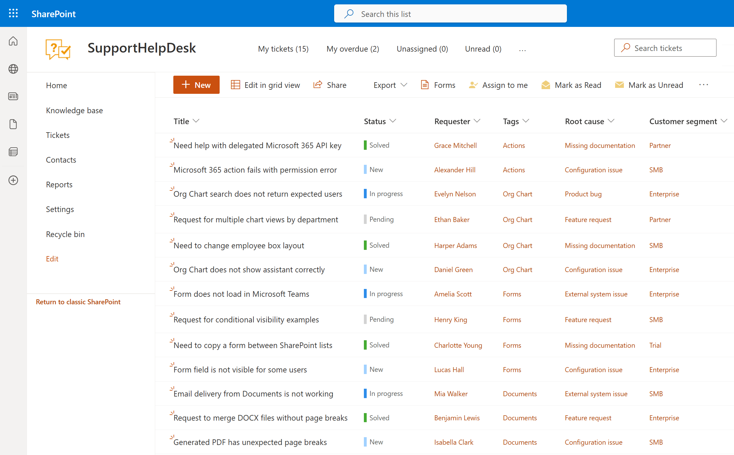
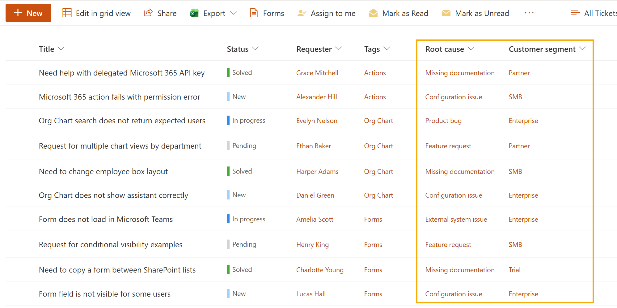
For this example, we use several tickets with default HelpDesk fields, such as Status, Requester, and Tags. We also add two custom lookup columns to the Tickets list: Root cause and Customer segment.
Prepare HelpDesk ticket data
Before you connect HelpDesk to Power BI, prepare the ticket fields that you want to use in the report.
In this example, we use the default Tags field to show the related product. We also add two custom lookup columns to the Tickets list:
Root cause: explains why the ticket was created.
Customer segment: identifies the type of customer.
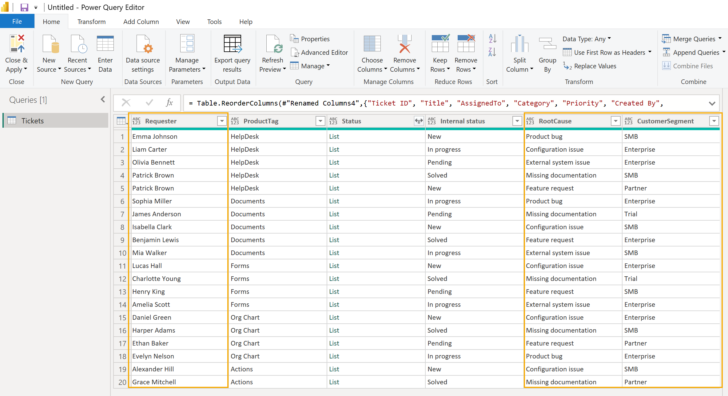
This is how the Tickets list looks with the additional fields.
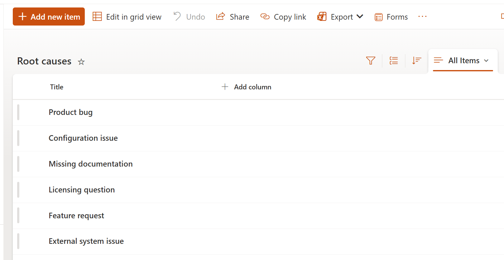
To prepare the same example, open the HelpDesk SharePoint site and create two custom SharePoint lists: Root causes and Customer segments.
In the Root causes list, add values such as:
Configuration issue
External system issue
Feature request
Missing documentation
Product bug
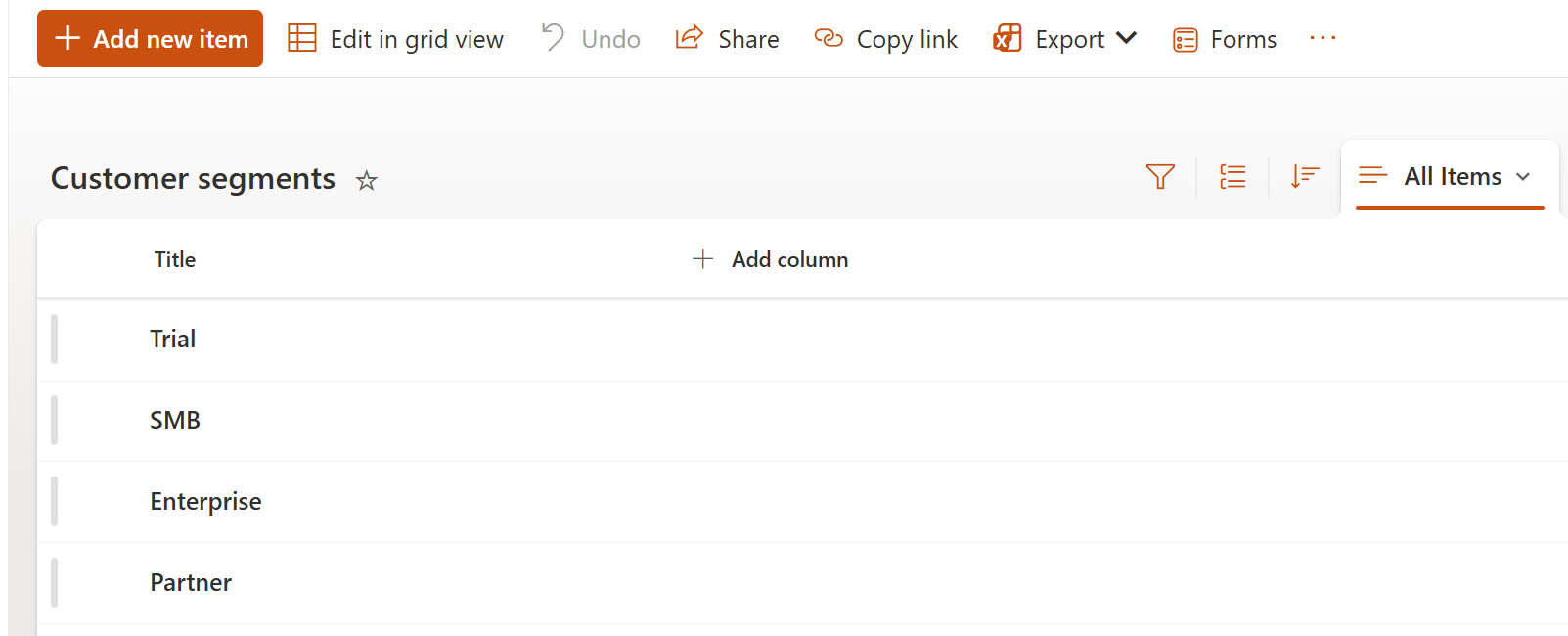
In the Customer segments list, add values such as:
Trial
SMB
Enterprise
Partner
Then open the Tickets list and add two lookup columns:
For product reporting, use the existing Tags field. In this example, each ticket has one product tag, such as HelpDesk, Documents, Forms, Org Chart, or Actions.
Note
If you use several tags in one ticket, Power BI can show one row per tag after expanding the field. This is useful for multi-tag analysis, but it can affect simple ticket counts. For a basic report, start with one product tag per ticket.
Connect Power BI to HelpDesk
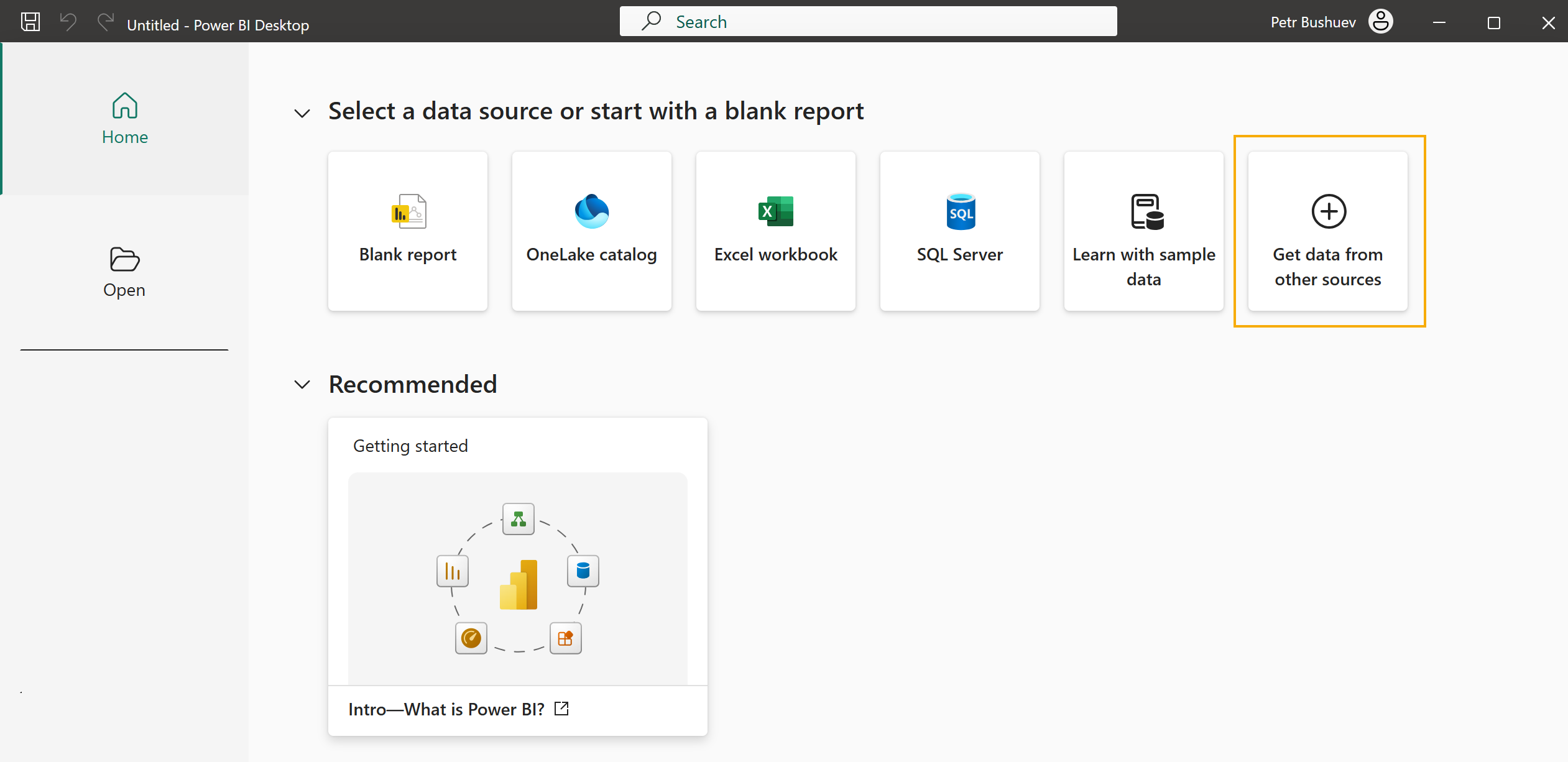
Open Power BI Desktop and connect it to the SharePoint site where HelpDesk is installed.
Select Get data from other sources.
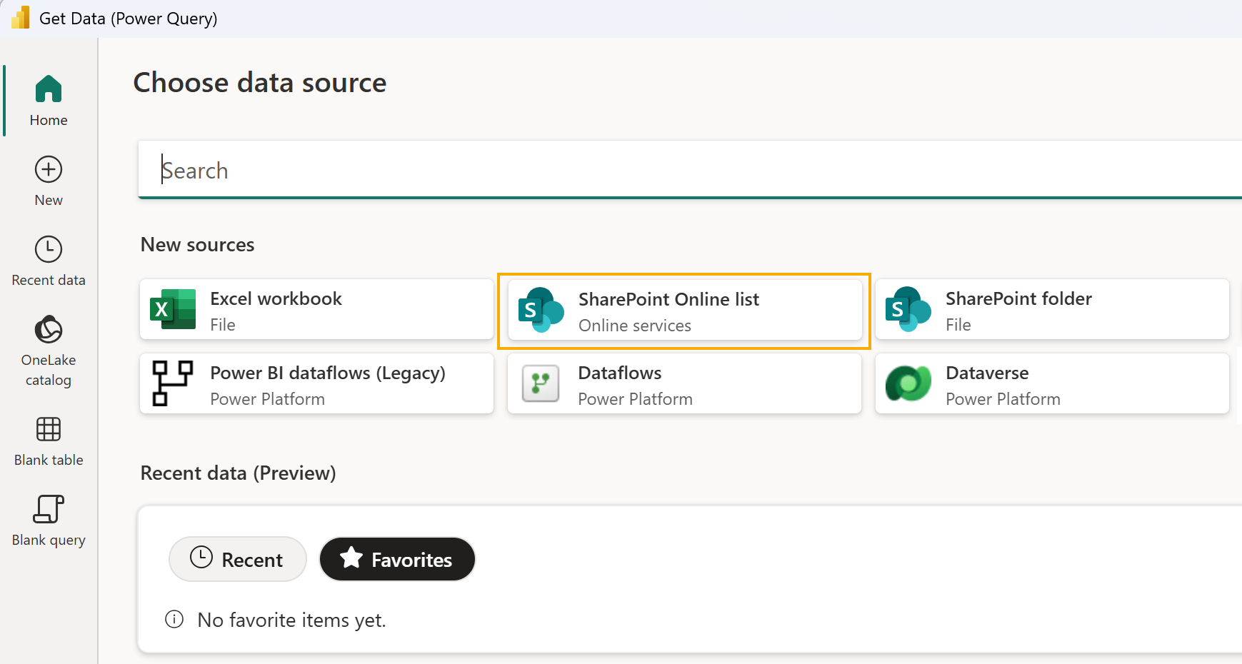
In the Get Data window, search for SharePoint Online List and select it.
Enter the URL of your HelpDesk SharePoint site.
For example:
https://contoso.sharepoint.com/sites/helpdesk
Use the site URL, not the direct URL of the Tickets list.
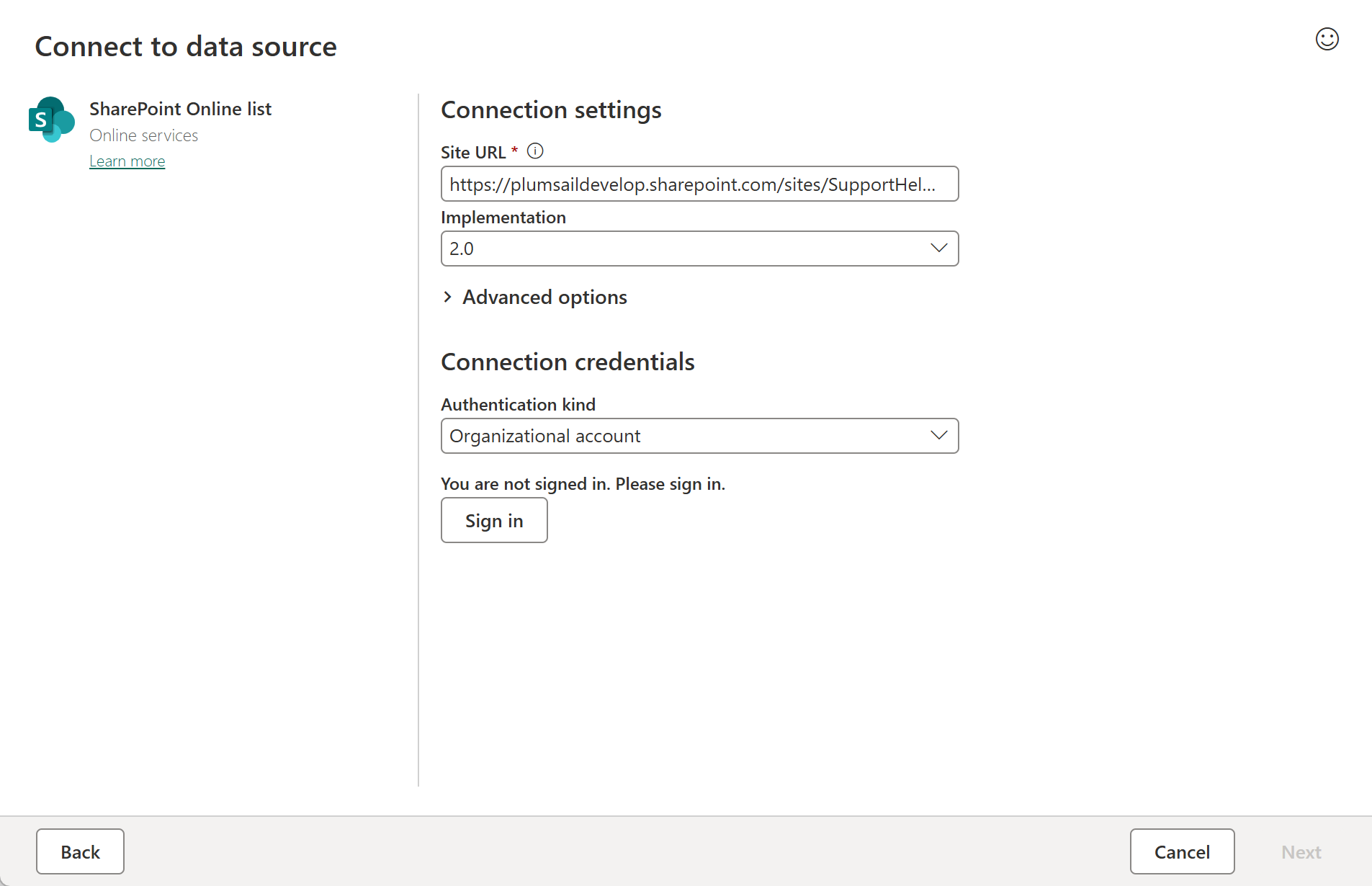
Sign in with a Microsoft account that has access to the HelpDesk site.
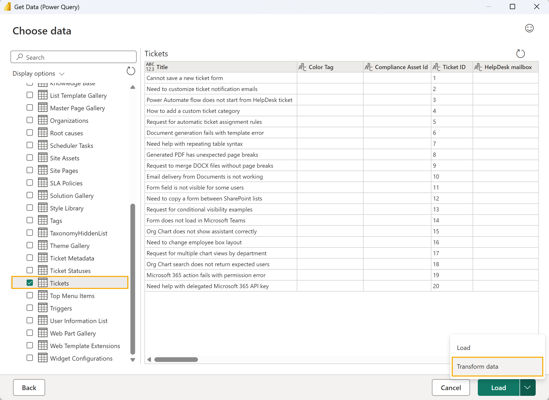
In the Navigator window, select the Tickets list. Then click Transform Data.
Power BI will open the selected list in Power Query Editor. Use it to prepare ticket data before building the report.
Prepare ticket data in Power BI
Power BI opens the Tickets list in Power Query Editor. Here you can prepare the data before using it in the report.
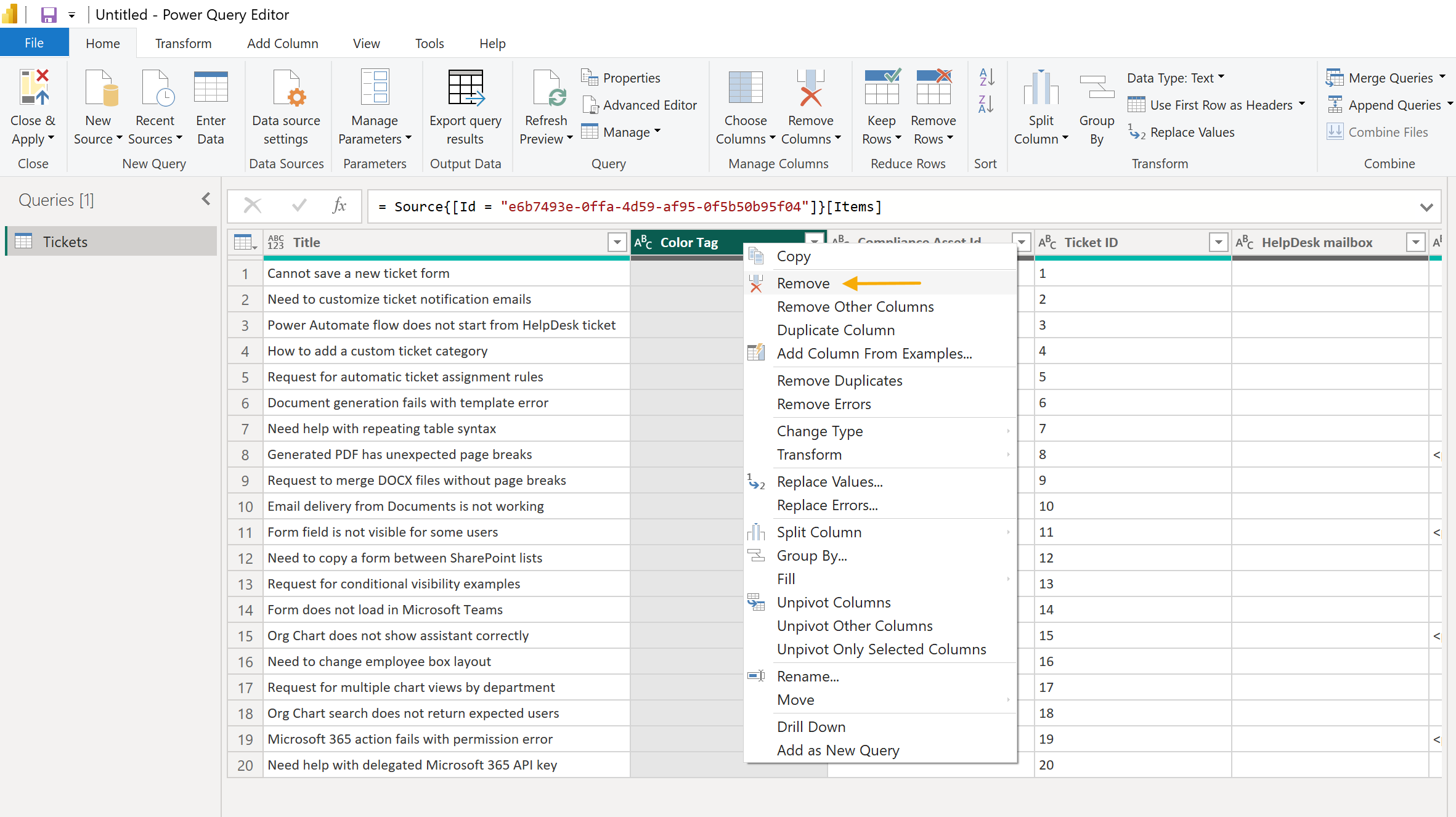
First, keep only the columns you need for the report. In this example, we use these columns from the Tickets list:
Ticket ID
Title
Assigned to
Category
Priority
Created By
Requester
Tags
Status
Internal status
Root cause
Customer segment
You can keep other columns if you want to use them in your own report.
Some HelpDesk fields may appear as List, Record or Table values in Power Query. This is normal for SharePoint lookup, person, and multi-value fields.
Expand the Tags column first. Click the expand icon in the column header and select Expand to New Rows. If the result is shown as a record, expand the column again and select the field with the tag name.
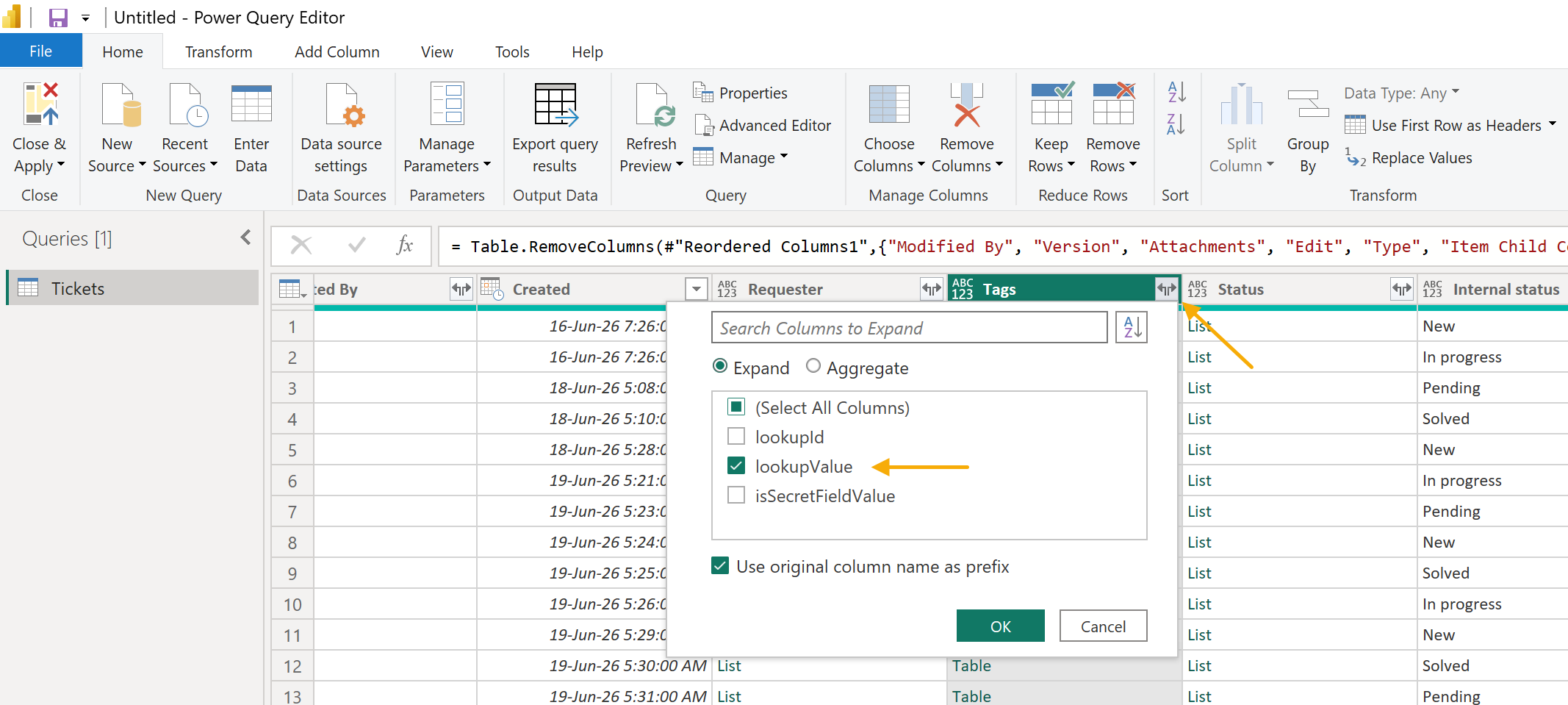
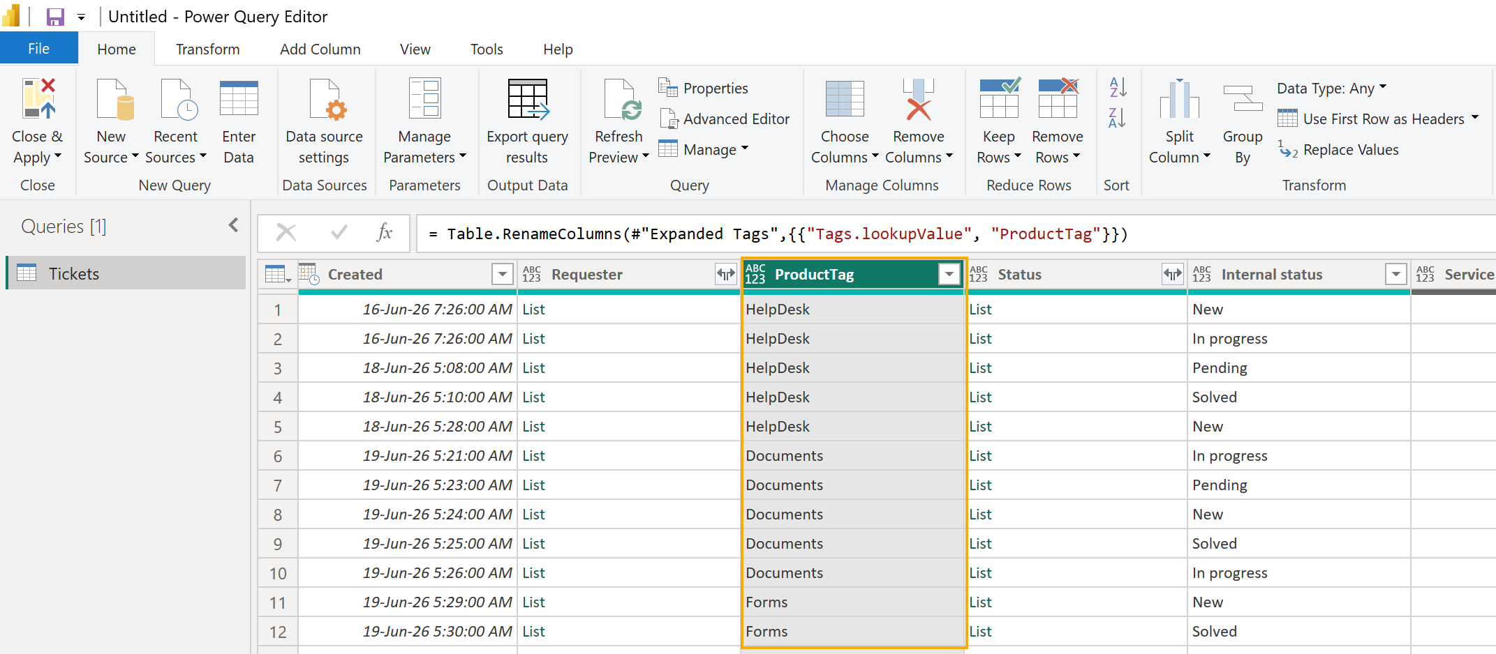
Rename the final text column to ProductTag.
Then expand the custom lookup columns in the same way:
Expand Root cause and rename the final text column to RootCause.
Expand Customer segment and rename the final text column to CustomerSegment.
If you want to show agents or requesters in the report, expand person fields such as Assigned to, Created By, or Requester and keep the display name or email field.
Make sure that the fields are easy to read in the report:
Internal status is used for ticket status measures.
ProductTag is used to group tickets by product.
RootCause is used to analyze why tickets were created.
CustomerSegment is used to compare ticket volume by customer type.
When the data is ready, select Close & Apply to load it into the Power BI report.
Add report measures
Now add several measures that will be used in report visuals.
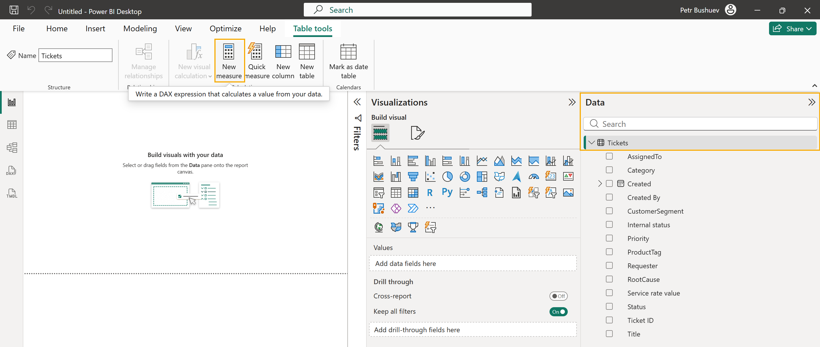
In Power BI Desktop, select the Tickets table and click New measure.
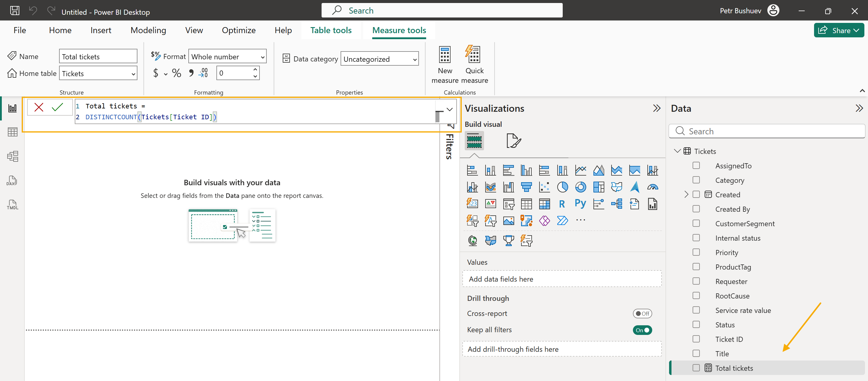
Use Ticket ID to count unique tickets. This is safer than counting rows, because one ticket can have more than one tag after expanding the Tags field. Enter the formula and press Enter.
Total tickets =
DISTINCTCOUNT(Tickets[Ticket ID])
Add a new measure for open tickets. In the default HelpDesk workflow, open tickets have one of these internal statuses: New, In Progress, or Pending.
Open tickets =
CALCULATE(
    [Total tickets],
    Tickets[Internal status] IN {
        "New",
        "In Progress",
        "Pending"
    }
)
You can also add separate measures for each status.
New tickets =
CALCULATE(
    [Total tickets],
    Tickets[Internal status] = "New"
)
In progress tickets =
CALCULATE(
    [Total tickets],
    Tickets[Internal status] = "In Progress"
)
Pending tickets =
CALCULATE(
    [Total tickets],
    Tickets[Internal status] = "Pending"
)
Solved tickets =
CALCULATE(
    [Total tickets],
    Tickets[Internal status] = "Solved"
)
After you create the measures, they appear in the Tickets table in the Data pane. You can now use them in cards, charts, and matrix visuals.
In the next section, we’ll add these measures to the report page and combine them with HelpDesk fields such as Internal status, ProductTag, RootCause, and CustomerSegment.
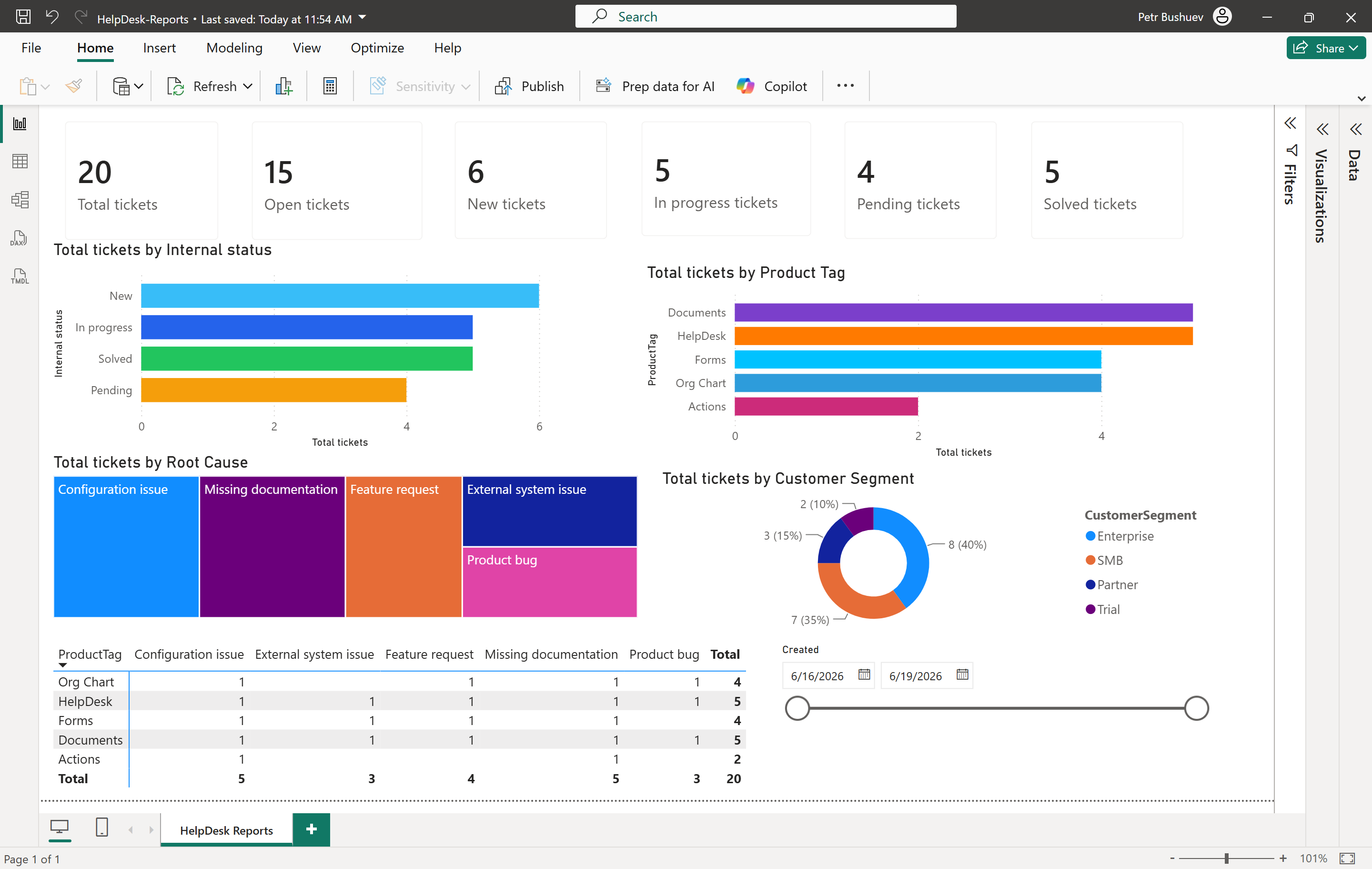
Build the report
Power BI reports can include one or more pages. In this example, we use one page for a basic HelpDesk overview.
Rename the default Page 1 tab to HelpDesk Reports. To add more report pages later, click the plus button next to the page tabs. For example, you can create separate pages for workload, agents, categories, or customer segments.
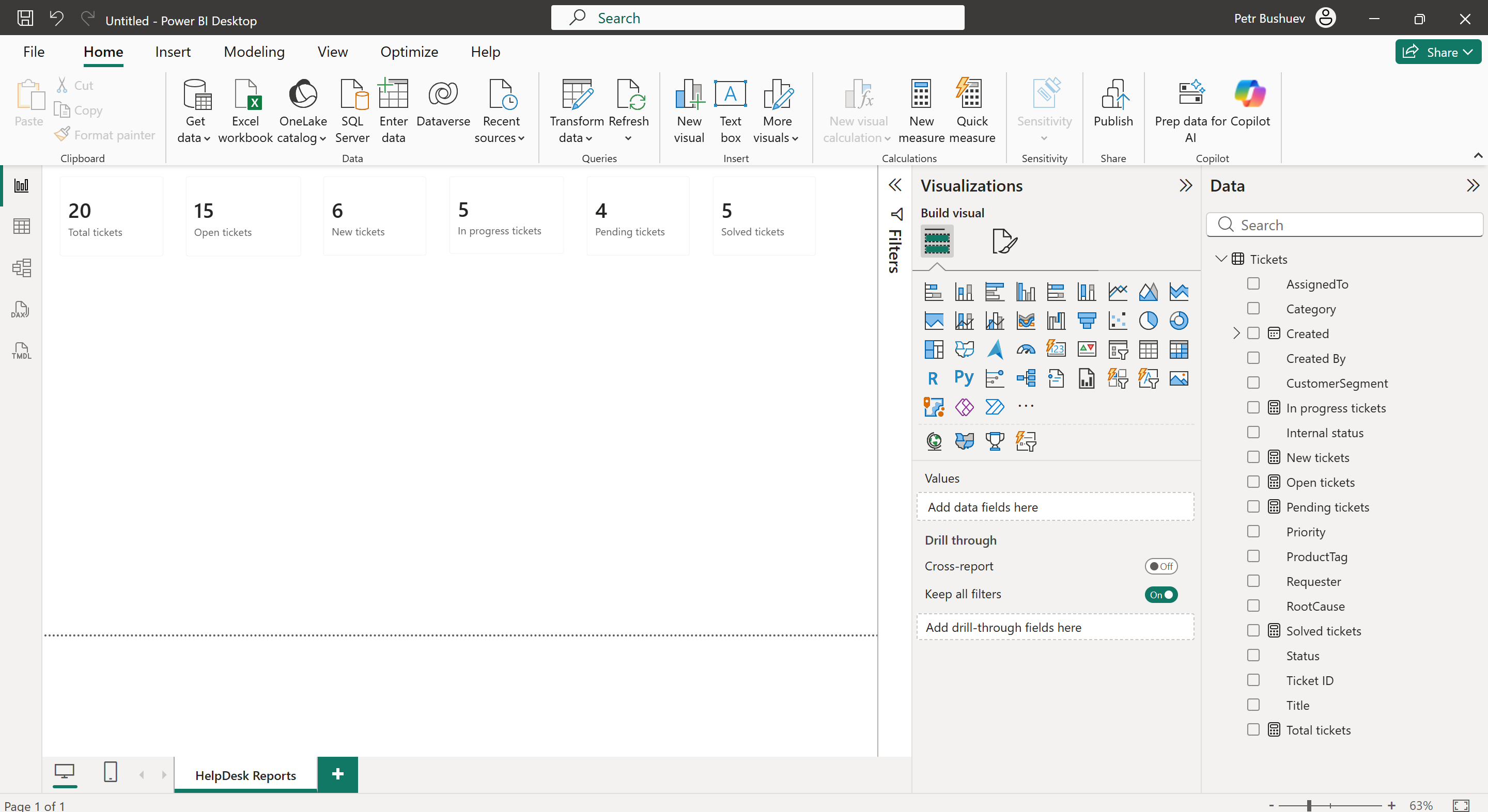
Start with several cards at the top of the page. Select the Card visual and add one measure to it.
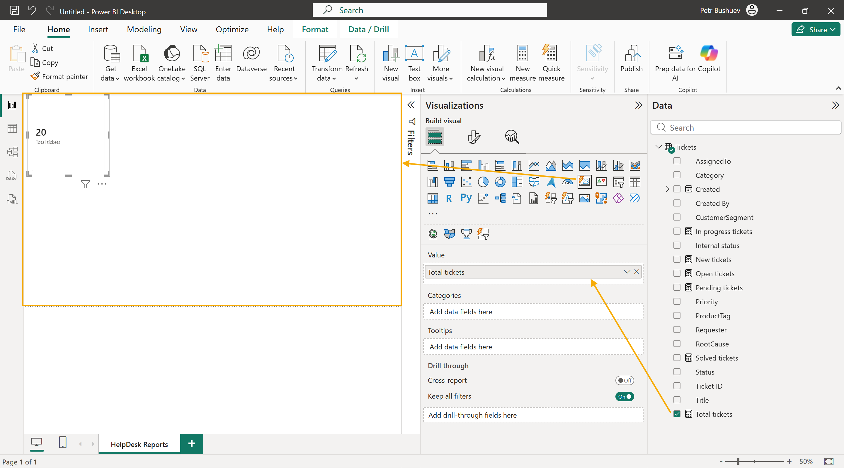
Create cards for:
Total tickets
Open tickets
New tickets
In progress tickets
Pending tickets
Solved tickets
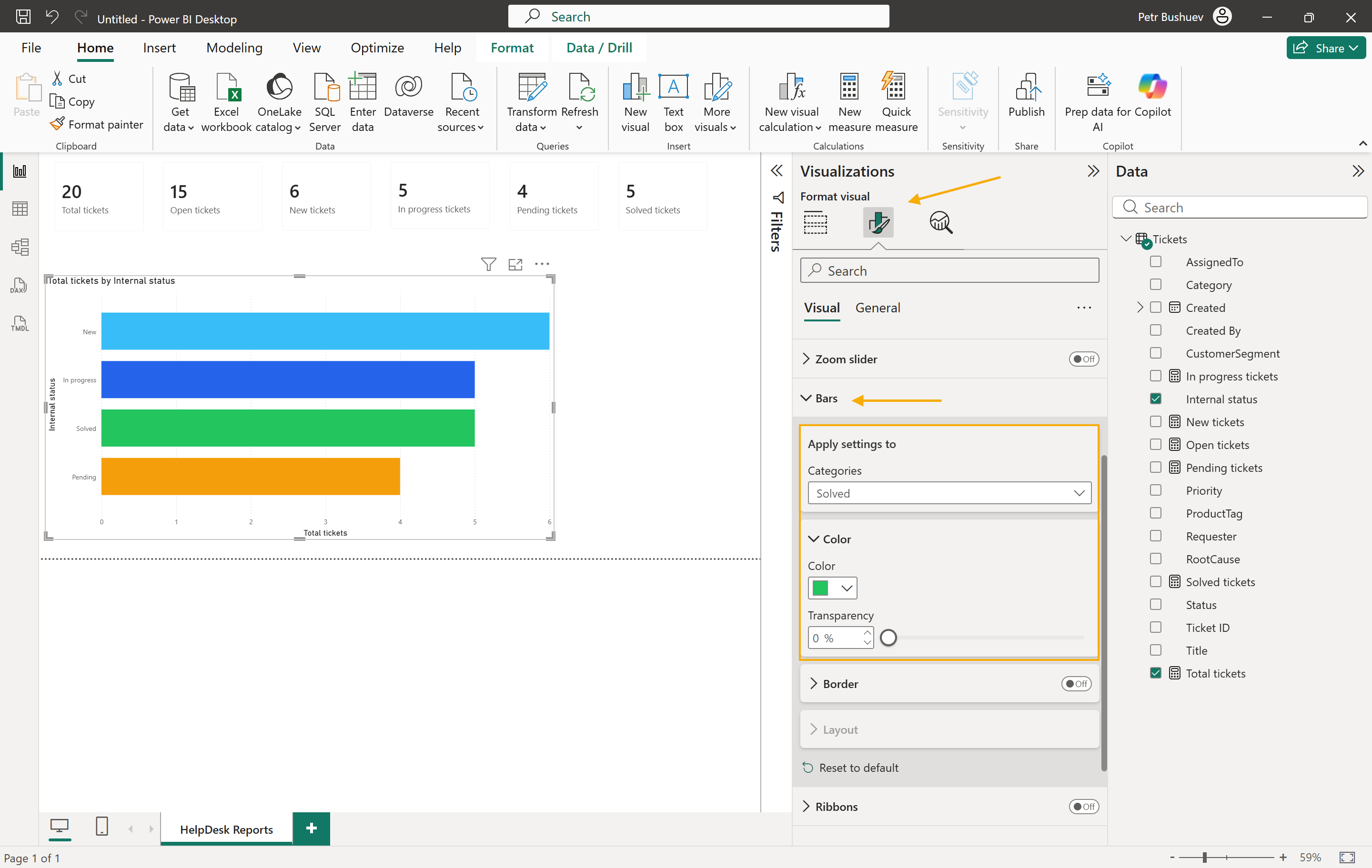
Next, add a bar chart to show tickets by status.
Use these fields:
Y-axis: Internal status
X-axis: Total tickets
This chart shows how many tickets are new, in progress, pending, or solved.
Optionally, change the status colors to make the chart easier to read. Select the status chart, open Format visual, and set a color for each status:
New: #38BDF8
In progress: #2563EB
Pending: #F59E0B
Solved: #22C55E
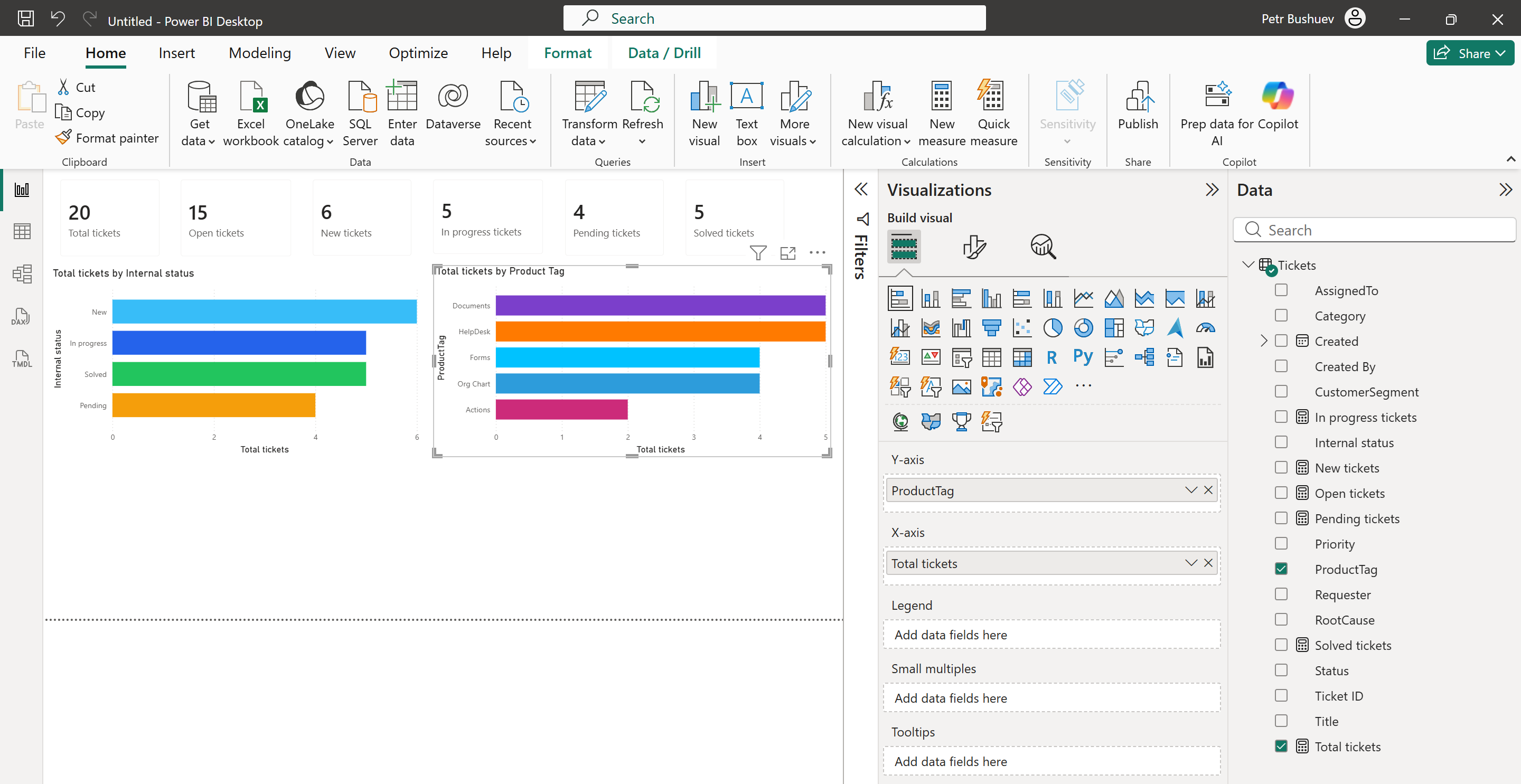
Add another bar chart to show tickets by product.
Use these fields:
Y-axis: ProductTag
X-axis: Total tickets
This chart uses HelpDesk tags as a product dimension.
You can use other visual types for custom lookup fields.
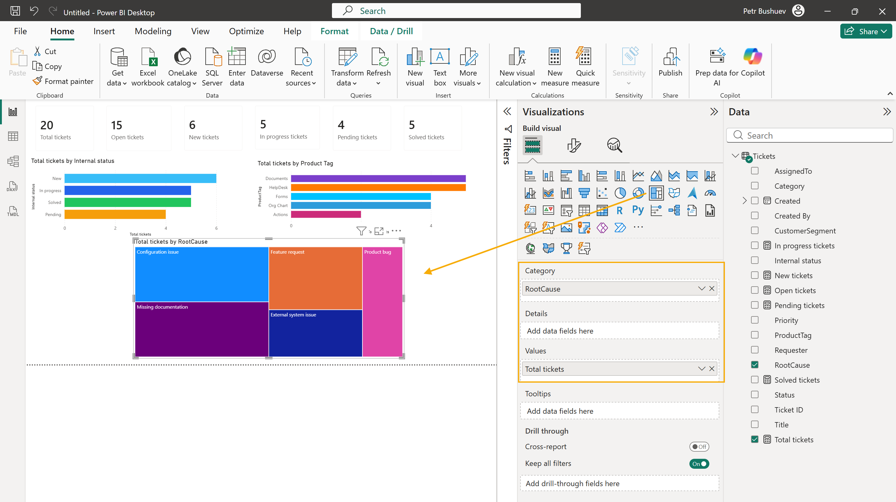
For example, add a Treemap visual to show root causes.
Use these fields:
Category: RootCause
Values: Total tickets
A treemap is useful when you want to quickly see which root causes create more tickets.
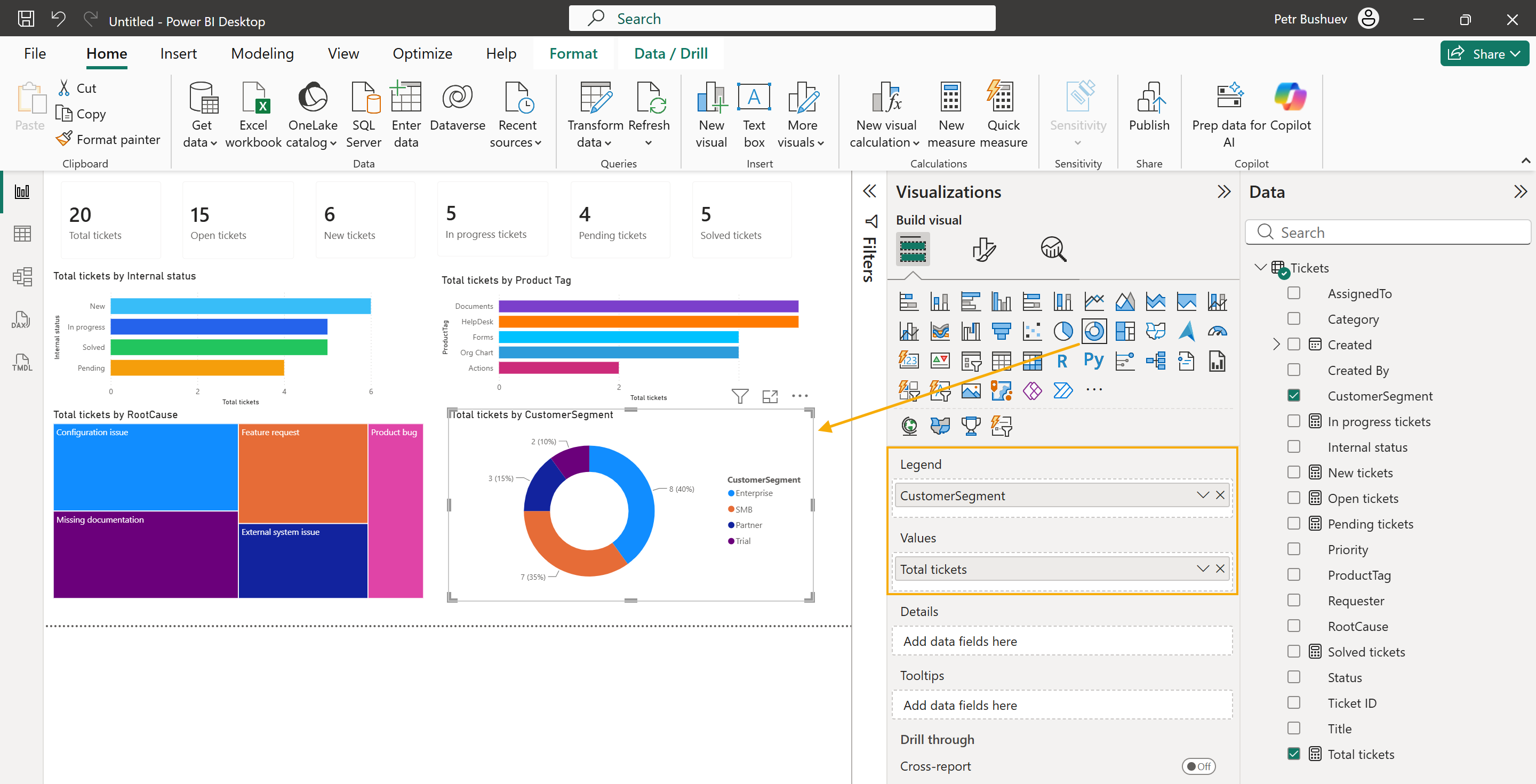
Then add a Donut chart to show customer segments.
Use these fields:
Legend: CustomerSegment
Values: Total tickets
A donut chart works well here because the report has only a few customer segments.
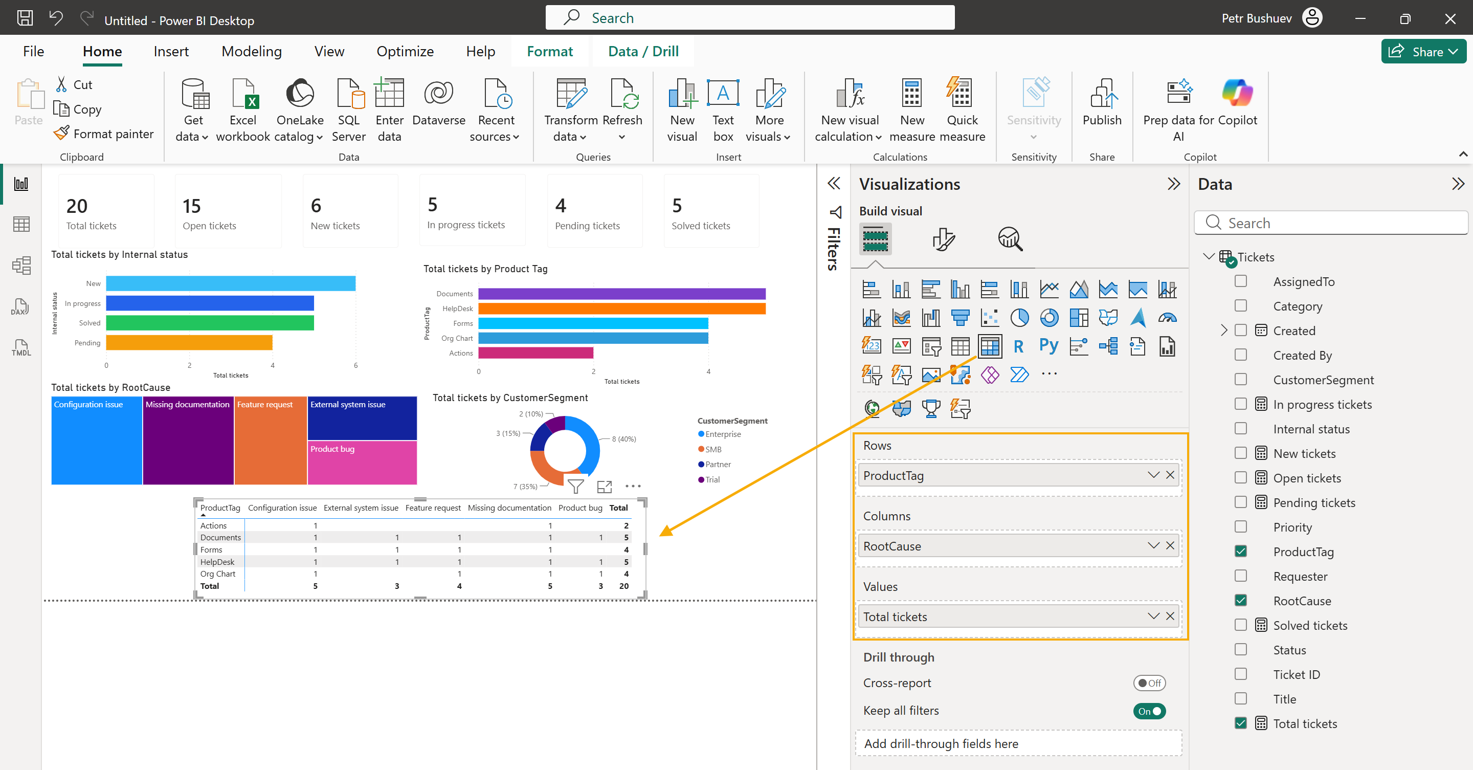
To analyze tickets by two dimensions, add a Matrix visual.
Use these fields:
Rows: ProductTag
Columns: RootCause
Values: Total tickets
The matrix works similarly to a pivot table. It shows how many tickets belong to each product and root cause.
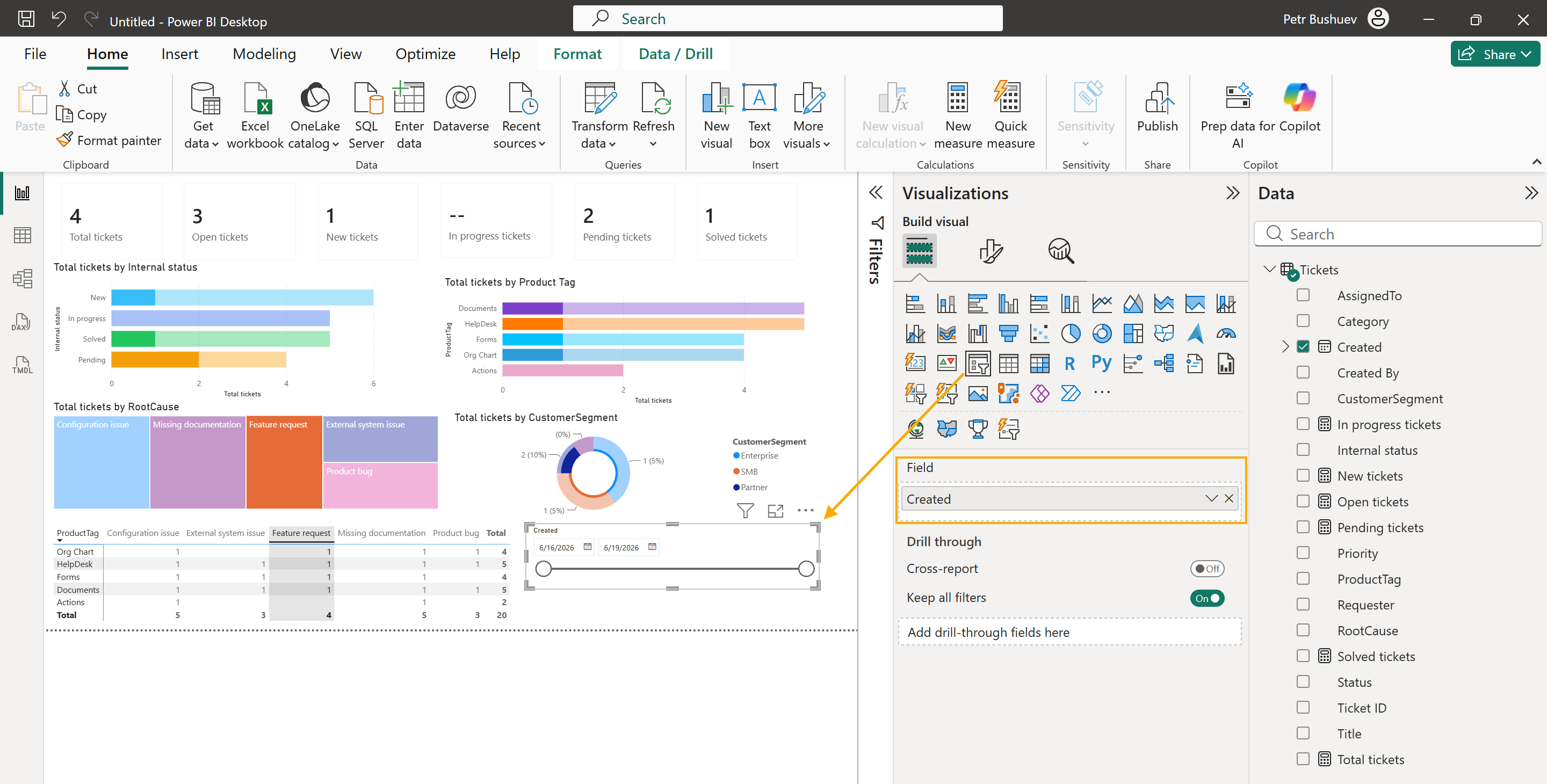
You can also add slicers to filter the report. For example, add slicers for Created, Internal status, ProductTag, RootCause, or CustomerSegment.
Refresh report data
When tickets are created or updated in HelpDesk, refresh the report to load the latest data from SharePoint.
In Power BI Desktop, click Refresh.
Power BI will reload the Tickets list and update the report visuals.
If you publish the report to Power BI Service, you can also configure scheduled refresh there. This is useful if you want managers or support team members to open the report and see updated HelpDesk data without refreshing it manually in Power BI Desktop.
This example is only a starting point. You can extend the report with more HelpDesk fields, custom columns, pages, filters, and visuals.